How waterfall looks, and why.
Light pages, one luminous ribbon, a mark called the Drop, and the product shown big. Everything here is generated from one approved source, so people and agents build the same thing.
Logo: the Drop.
One disc, sliced once, the right half dropped. The fall line, and costs falling. Built from two exact arcs, it reads at 16px and on a billboard.
Do
Use the blue Drop on white, the white Drop on ink or blue, and the Drop on a blue tile as the app icon.Don't
Stretch it, rotate it, add a gradient or outline, or put it on the ribbon where the edges disappear./brand/waterfall-mark.svg/brand/waterfall-mark-white.svg/favicon.ico


Colour: ink, blue, and light.
Pages are white and tint. Ink carries words. Blue means action, links, and the mark. Green is only ever money saved. The ribbon is the one place colour sings.
Do
Keep blue scarce so it always means "you can act here".Don't
Use green for anything but savings, or put body text on the ribbon.--ink #0a2540--blue #0a6fd6--tint #f6f9fc--good #08744e#0a2540#0a6fd6#f6f9fc#08744ecyan, blue, violet, tealTypography: light and large.
One family, Inter Tight, self-hosted. Headlines are big and light (weight 300) with tight tracking. Labels are sentence case, never tracked capitals.
Do
Let one headline carry the page. Keep body at 17px with room to breathe.Don't
Use bold display type, uppercase eyebrow labels, or text under 12px.72 / 300 / -0.035em48 / 30017 / 400 / 1.6Pay the least.
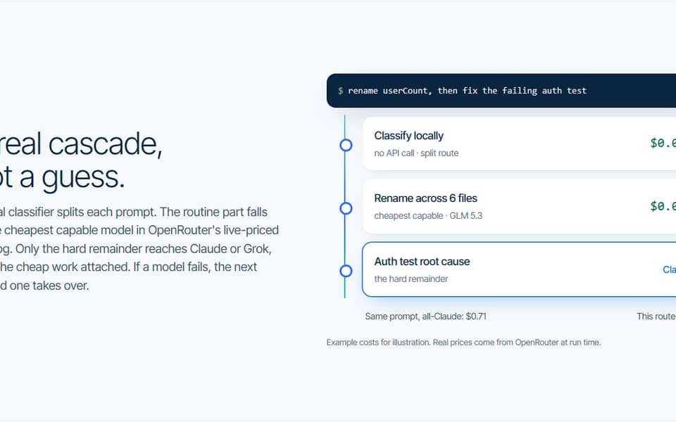
A real cascade.
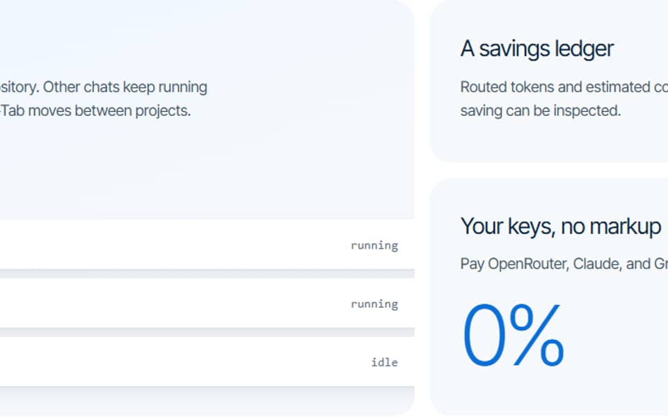
One local board for all your repos.
Sentence-case labels, 12px minimum.
Ribbon: the one art layer.
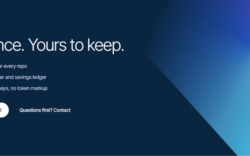
A luminous cascade of cyan, blue, violet, and teal, crossed by fine falling lines. It appears twice: behind the hero, and again in the closing band.
Do
Let it bleed off the top right and fade into white before it reaches the words.Don't
Add a second art style, or place copy or the mark on top of it.var(--ribbon)clip-path + maskProduct: show the board, big.
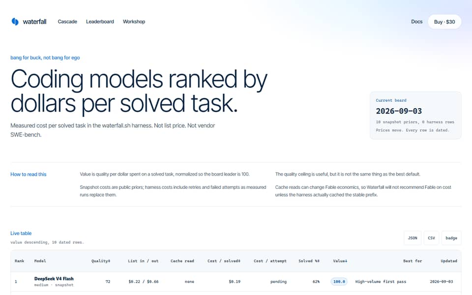
The local board is the hero image: large, overlapping the ribbon, running off the edge. A few real words, quiet placeholders for the rest, and example numbers always labelled.
Do
Crop the window so it bleeds off the page, with depth from soft shadows.Don't
Shrink it into a boxed card, or show savings that were not measured without a label.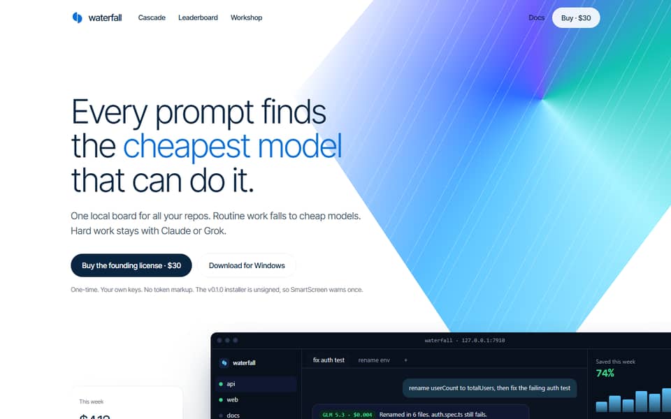
Layout: one idea per section.
1200px wide, 128px between sections, 22px tile corners, pill buttons. Promises go in a bento with one wide tile, never three identical cards.
Do
Vary tile sizes so the most important idea is the biggest.Don't
Repeat label, headline, paragraph, card grid in every section.--max-width 1200px--section 128px--radius-tile 22pxMotion: quick and quiet.
Only colour and shadow move, in 300ms on one ease-out curve. Under reduced motion, nothing moves at all.
Do
Confirm a hover or a press, then get out of the way.Don't
Animate layout, slide sections in on scroll, or loop anything.300mscubic-bezier(.22, 1, .36, 1)Voice: terse and honest.
Write like a developer explaining it to a friend. Short sentences, real numbers with their source, limits stated plainly. No hype, no em dashes.
Do
"The installer is unsigned, so SmartScreen warns once."Don't
"Revolutionary AI-powered savings, guaranteed."Routine work falls to cheap models. Hard work stays with Claude.
Example figures, not measured savings.
Unlock limitless AI efficiency today!
In use.
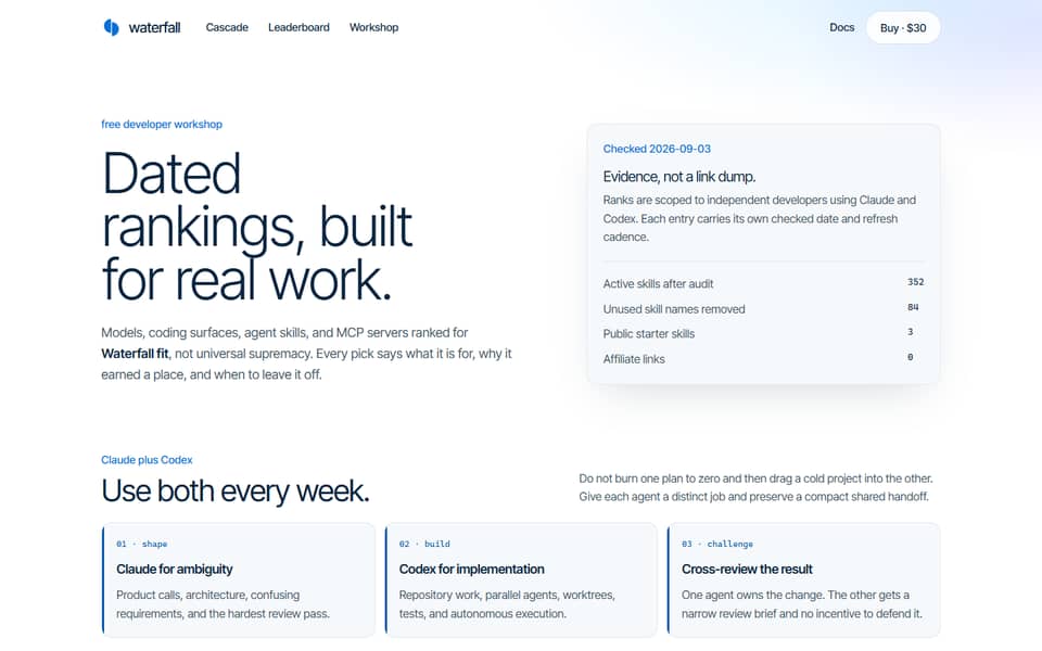
The system on the live site.
Docs for agents.
Machine-readable, generated from one approved source, readable cross-origin.
system.json
The full Shapeable v3 pack: identity, tokens, patterns, voice, rules.
https://waterfall.sh/design/system.jsontokens.json
W3C Design Tokens: colour, type, space, radius, shadow, motion.
https://waterfall.sh/design/tokens.jsontokens.css
Drop-in CSS variables, including var(--ribbon).
https://waterfall.sh/design/tokens.css